His sculptures, on the otherhand, I found boring. I chose the "K" sculpture because I can really see the amount of work and time he spent putting into crafting it. But overall, They didn't do much for me.
Wednesday, April 27, 2016
Adam McEwen
Overall, I found McEwen to be an interesting artist. My favorite part about him by far is the obituaries of people still alive. I found that unique, and can speak towards how people take things written down as gospel. Even if we knew a person was alive, we would have to think twice if we saw an obituary about them.
His sculptures, on the otherhand, I found boring. I chose the "K" sculpture because I can really see the amount of work and time he spent putting into crafting it. But overall, They didn't do much for me.
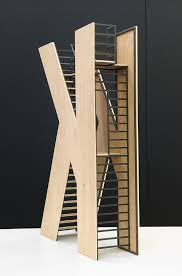
His sculptures, on the otherhand, I found boring. I chose the "K" sculpture because I can really see the amount of work and time he spent putting into crafting it. But overall, They didn't do much for me.
adam mcewen conduit art concept

-Aimee
Adam McEwen

I found McEwen's way of thinking intriguing. This installation doesn't seem like it's much; it's just a picture of a tunnel. But his though process behind movement and how humans perceive it.Movement can be both freeing and constraining.
Adam McEwen

I chose the "Lock" that is found near the four black and white paintings. I chose the lock because it is so simple, it made me want to know more about why it was there. It being symbolic to "prevent easy access" much like the door to floor locks in some new york lofts today. His work seems so simple, yet has many different meanings behind it.
Adam McEwen

I found this to be an interesting sculpture. Although it is pretty simple, a white table with a couple of with a couple of trays on top, we all know what this is representative of even taken out of context. For this reason, although it is simple, I think it can make a big statement. When reading further about the sculpture, the thought behind the creating this particular sculpture was very intriguing to me; especially where it is stated that "you empty your pockets to prove you hold no items intended to cause harm. It is taken as a matter of course that movement from one place to another is closely shadowed by the threat of imminent erasure." This idea is somewhat depressing, that as you move through life, it can sometimes be stalled, but death is unavoidable and always looming.
adam
I THOUGHT THIS WAS FASCINANTING BECAUSE ITS ALMOST LIKE A C ASTLE FOR LITTLE KIDS, AS WELL AS THE INTERNAL STRUCTURE OF BEING A LADDER AND A STAIR CASE WHICH ALSO LEAD TO A BALCONY STANDING ON THE TOP.

Adam McEwen

what this is crazy, I love the texture. just wow. the simplicity and foresight into the modern world really blows my mind. To me he is making fun of how the material world we created affects us. cubed ice is always interesting.
Adam McEwan Battery Tunnel Photograph

I did not like any of the sculptures from Adam McEwans' Harvest exhibit. I feel like he was trying to pass off nothing as art, and he pulled his explanations out of nowhere on the spot. I understand the concept he said he was trying to get across, but I just felt like it was very insincere and without real thought. I chose his photograph of the Battery Tunnel because I felt his pictures were more intentional and thought provoking than the sculptures he displayed.
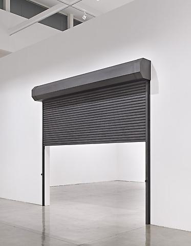
Adam McEwen: TSA

At first, this display does not seem like it should be considered artwork but when I looked at the meaning behind this display I realized that this is more than just a security table. McEwen uses this security table to showcase that there are many delays and standstills in life. This is a minimalism based sculpture but has a message to go with it to make people think. It makes you think about what is delaying your life and the constant waiting that we must endure in our lives.
K-Stairs

In general I like the article and the insight the artist gave on his work. I found the orbituary idea intriguing and I will go and check out those pieces. I like this piece from his exhibition now because of the idea it present. That artist spoke about the idea of doing art that won't be able to deliver anything but still creating despite that fact. So in fact, I feel like this K with the stair serves this purpose. The steps are available and usable but they ultimately leads no where. It also is very simply built and has a minimalist appeal even though it 19ft high.
Tuesday, April 26, 2016
Adam McEwen

http://www.artnews.com/2016/04/22/castles-in-the-sky-adam-mcewen-on-harvest-his-show-at-petzel-gallery/
Review this article and choose on of his images from his new show at Petzel Gallery to post and comment your opinion.
Wednesday, April 20, 2016
Thursday, April 14, 2016
Columbia Sculpture
I know that I didn't do this blog on time but I still wanted to contribute because I feel bad about forgetting the assignment. I think that the sculpture is well suited on the Columbia campus because it is a school that is valued by more than just the students for art and culture. I like the idea of the Henry Moore sculpture on the campus because I think that it will be most appreciated somewhere like Columbia and placing art somewhere where it has the potential for maximum appreciation is important. I think that if a large percentage of the students that attend the college have a legitimate problem with the statue, then there should be a compromise on where the statue is placed rather than if the statue is placed on the campus. Art is something that impacts everyone that comes into contact with it so I think it makes sense to try and work with all of the students on the campus considering that they will be seeing the piece the most.
-Aimee Caron
-Aimee Caron
Wednesday, April 13, 2016
Henry Moore

I would not feel negatively about having a piece of art work such as this on my campus, I believe this artwork is beautifully reformed and has a psychedelic feel to it. I believe it inst inviting to the campus students, although it shares another purpose. It speaks to me as if it means a new beginning, forming from the past events we have went through and growing into our own to now make it to the campus of our choice. i would love to have artwork like this on our campus so that every student can be able to connect with the piece in their own way.
Victoria Laiso
Henry Moore

Henry Moore

I chose this picture because I liked that it looked like George Washington, but has boobs like a female. the body is totally out of proportion from head to toe with the head facing a completely opposite way...reminds me of an owl.

My boi Henry
People are always too worried about being politically correct. It would be stupid to assume college students don't know what sex is, and shouldn't be "hidden" from public eye. I think the piece is great; it does exactly what art should do: create controversy.


Henry Moore

I would want this sculpture on my college campus. Reclining Figure is a beautiful sculpture that is a positive depiction of parenthood, and as individuals entering college and becoming adults I think it speaks volumes about upcoming responsibilities. As the parent figure seems to be gender neutral, it also can speak to everyone universally. I also think it is aesthetically pleasing with its smooth flowing form.

Henry Moore

I think that the students have nothing better to do than protest a beautiful piece of art. I think the students that are protesting are ignorant and probably haven't been in an art class since elementary school. I think they are undereducated in the area of sculpture because even if they think it is "ugly" it is still a remarkable piece of art and they should be so lucky to have it on their campus. I think they should find something else to do with their time, maybe take an art history class.....
Henry Moore
While I do not hate the "Reclining figure" by Henry Moore, it is not my favorite sculpture. I understand where the students at Columbia are coming from. I think that the students at Columbia should be allowed to have an opinion and that opinion should be taken into consideration if a majority of students feel the same way (although this doesn't seem to be the case, due to the lack of protesters). If the students are not able to appreciate this sculpture, perhaps it would be better to place it where it could be fully appreciated. A different university or community may be more open to having this sculpture on their campus.
The "Reclining Figure" is a sculpture in which I am indifferent. I do not hate it but I also don't love it. However, there are several of Henry Moore's sculptures in which I find to be much more appealing and interesting. Such as this sculpture, in which I really like how the sculpture is presented and the curves of the figure.

Henry Moore

So as artist I am highly offended by the fact these students and alumni are against the artistic expression of Moore. Art is what you make of it, it should be a free form of expression from within the artist. I also truly believe that not all art is not beautiful or has a pleasing aesthetics. In the past we had Dadaism which was seen as anti-art however, I believe it was still art wether it was provocative, disturbing or doesn't conform to the usual convention of art. Art also can be appreciated despite its functions and physical properties. In the Defence of Moore viewers and audience of any art have to be mentally mature to appreciate the piece.
Henry Moore
I think the sculpture at Colombia isn't a big deal. If the school has to pay money for it then its a different story, but if its being donated then I think the students are just complaining to complain. The students don't think its anything special and I can agree with them, its just a random flowing idea of a woman's body with partial accents that can identified but other than that its pretty generic
However in this sculpture by Henry Moore it involves a mother and a child. The mother has larger features around the legs and arms to present a larger limbed woman and the position at which she seats might suggest that Henry found women of this stature more appealing.


However in this sculpture by Henry Moore it involves a mother and a child. The mother has larger features around the legs and arms to present a larger limbed woman and the position at which she seats might suggest that Henry found women of this stature more appealing.


Henry Moore
I think that if it had nothing to do with money, i wouldn't care. Some of his work is nice in my opinion like the one shown below. But if the institution had spent a large amount of its funds obtaining the piece being debated, i wouldn't be thrilled. However, i would say that if it were any expensive non-interactive work. A campus can be beautiful without art work, but i think that the addition is always nice. I wouldn't have even thought to protest against it.


Henry Moore
I agree with the students, I don't think that this specific Henry Moore sculpture is suitable for the campus. I don't necessarily think that this Henry Moore sculpture is ugly, but I think it should be showcased somewhere else where people would appreciate it more. I think that it is an eye saw on the campus and, like the students say, doesn't fit the atmosphere of the campus.
This particular sculpture is showcased in Hakone Open-Air Museum. It is named the Family Group(1948-49) and the medium is bronze. I like this sculpture because I like how he connected the three family members together. To me, this represents the unity of the family and shows a strong bond between all of the family members. I also like the unique body shape of the people and how they aren't anatomically correct. This sculpture is very interesting and I also like how it is displayed outside.

Henry Moore
I wouldn't mind having an installation on my school grounds, especially if it's from an artist like Henry Moore. He is well-recognized, he's been written about on the Times. His sculptures can be worth up to 19.1 million pounds(see my pic). Columbia students should be honored to have something like that on their campus.
With that being said, I really like Henry Moore's Reclining figure. It's an abstract nude figure in bronze.

With that being said, I really like Henry Moore's Reclining figure. It's an abstract nude figure in bronze.

Tuesday, April 12, 2016
You Are A Columbia University Student for a Day
http://www.huffingtonpost.com/entry/columbia-students-protest-this-sculpture-for-being-too-dang-ugly_us_57053704e4b0b90ac270e5d4?utm_hp_ref=sculpture
Take a side and tell me why. Post a sculpture by the British sculptor Henry Moore.
Take a side and tell me why. Post a sculpture by the British sculptor Henry Moore.
Wednesday, April 6, 2016
Herrings

Watching the current film King of Herrings I was amused with every ounce of film time. While watching the film every camera angle was impressive and had more meaning hidden behind each shot. I love how the producer choose black and white for the recording of the film, and it was filmed in present day, although the black and white made the movie look aged or old fashioned. This film spoke to me and caught my attention from beginning to end. I loved how almost every scene the men were eating food at a dinner and or bar. I also loved the mirror scenes and how you could picture the actors and actresses through different angles.
Victoria Laiso
Shot choice:Herring

From a filmmaking point of view there are several interesting things about this independent film that is commendable. One main aspect is their shot choices. There are several shots that is intentionally obscured and as a viewer you are disturb by the shots. One of the specific shots that I found interesting is the one where the guy is vomitting and the camera follow the action of them walking away upside down. Otherwise I do like the film and it has a lot of potential.
King of Herrings
This movie was filmed very well and even though it's in black and white, it looks very modern. Arthouse films are not the usual and it may be difficult to understand at first. So far, I like how raw the film is. It has a very dark feel, paired with some humor.
King of Herrings
I thought the movie was creative there was a lot of good camera angles and the black and white fit this movie the right way. I did feel as if there was no plot to the movie but people yelling at one anther although we did not fish the movie. i did think it had potential to be something I would enjoy and would give the rest of the movie a chance.
King of Herrings
I liked how this movie was composed and I think that the character development is great. One element of the movie that I liked was the music score and the black and white coloring. I thought that this combination of old sounding music and a colorless film creates an aged appearance that compliments the timeless conflicts that the characters have. I loved this film because of the respect that it deserved for the art no matter how much I hated the characters. 10/10 would watch again
Aimee
Aimee
King of Herrings
I am not enjoying this film so far. There are pieces of it that I think were smart decisions such as the black and white overall movie choice and the vintage feel it brought out in this film. I am not enjoying the language, I think there is a lot of unnecessary language that is just filler script and doesn't add anything to the plot. I think it is dry and the only thing that has kept my attention is the smoker with the speaker box because it adds something less monotone to the film.
King Of Herrings
At first I was excited because I liked the main character, the guy that is always cursing and seems to hate his life (thought he was rather funny in all the ocean 11,12,13 movies). but as it went on it kind of lost my attention. I thought it got a little boring. but I thought the camera work was interesting. the way they shoot it, from the angle, to the color. but still not my kind of movie

King of Herrings
I didn't think that the movie was very good. I thought the plot was flat thus far and the film being in black and white was a cop-out. It was a Brooklyn hipster attempt at a Woody Allen film, making it hard to watch when accompanied with delayed actors that didn't seem to know where the plot was going themselves.
Tuesday, April 5, 2016
King of Herrings

What stood out to me the most about this indie's film was that is was very raw and vulgar. I think thats what made it interesting. I liked the black and white imagery and the camera movement was spot on, it felt like you were actually in the room. The New Orleans men's conversation was very strong and contained a good amount of profanity. The two main characters that stood out to me were Ditch and Mary. The main character, Ditch, was a hot head and irrational most of time. At times, I couldn't believe the way he was acting or what he was saying to his friends. Mary, on the other hand, was very passive and almost seemed as if she was playing dumb at times. She seemed to be relying on pain medication to get through the day, which could explain her aloof personality.

Subscribe to:
Posts (Atom)